Grey Soapstone Countertops keep this LA kitchen light and bright

Award-winning lifestyle host Laurie March has home improvement in her DNA. A third-generation remodeler (her great grandparents started a roofing company), the host and creative force behind HGTV’s The House Counselor first discovered her passion for taking on a diverse range of design challenges after moving to Los Angeles in the early 2000s.
More than 50 high-profile projects later, Laurie’s roster of clients appreciate her meticulous approach to project managing and remodeling, where she manages both the emotional and the analytical aspects of a design project – skills that came in handy when she and her husband decided to do a full renovation of their 1920’s Spanish style home.
She wanted to make her home a sanctuary from the bustle of the city – she’s within walking distance of a Target and two malls – by making thoughtful modern choices that honor the 100 year old home’s history while also melding the inside and out. That meant choosing timeless materials and definitely not taking down walls for a ubiquitous open floor plan layout.

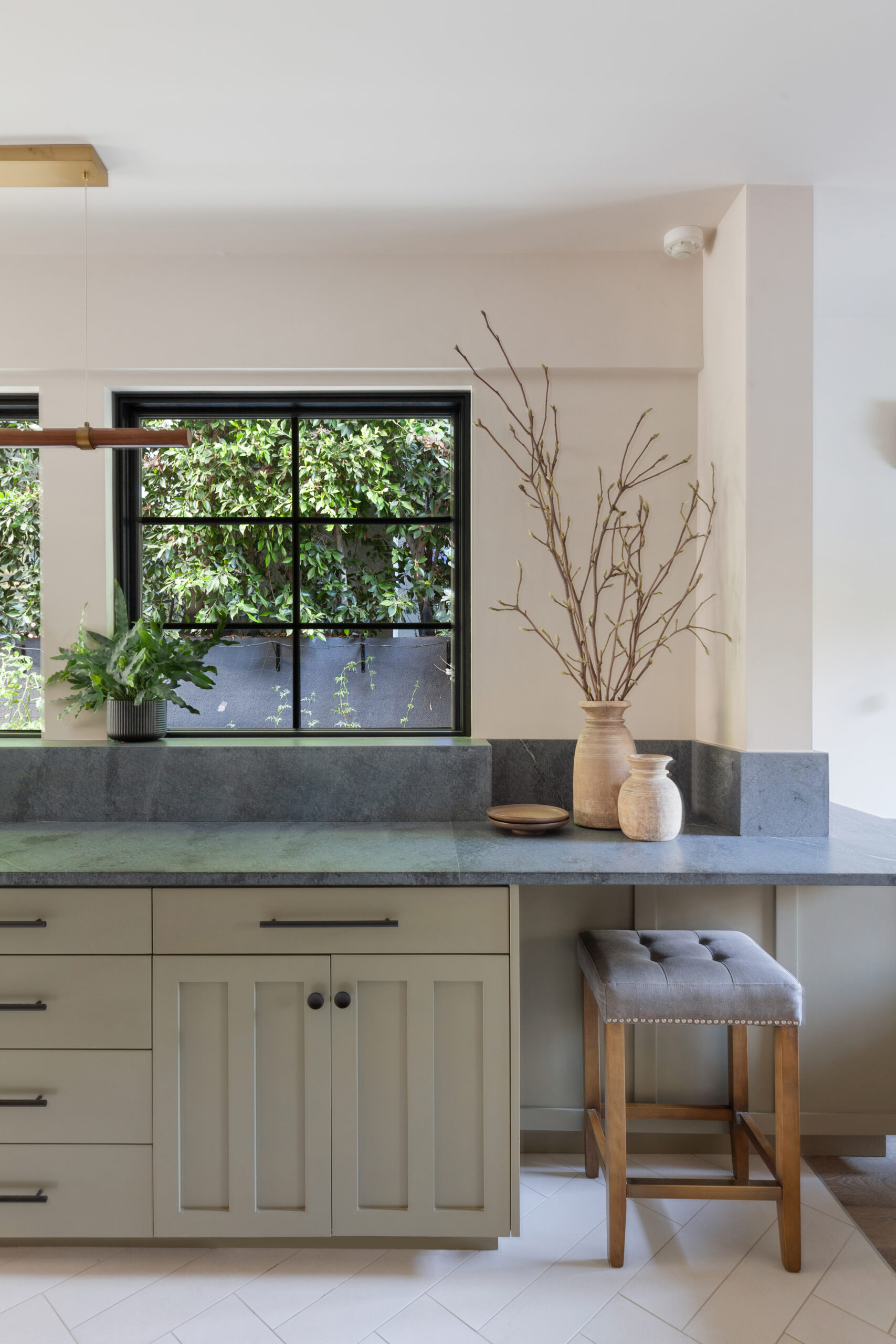
A large wall of Anderson windows above the ALBERENE SOAPSTONE™ countertops blurs the line between the indoors and the lush greenery outside.
“I like to have a little bit of separation,” Laurie said. “It helps me feel more mindful of what I’m doing in any space. I want rooms that feel like they’re tucking me in, or they have a purpose.”
The renovation was purpose-driven from the start. They nearly doubled the square footage by adding a second floor, where three bedrooms and two bathrooms are now located, and they removed a bedroom and a bathroom downstairs to expand the original kitchen’s footprint and maximize their connection to their outdoor spaces.

Grey soapstone countertops, with their naturally light tonality, lend an organic quality to the kitchen.
By living in the home for a couple of years before the renovations began, Laurie was able to create a comprehensive list of changes she and her husband wanted to make: They took the structure down to the foundation and raised ceiling heights while efficiency-focused and sustainable choices — like solar panels, a tankless water heater, and a rainwater collection system throughout —were layered into the design.
“I’m so grateful for that time,” Laurie said. “Because I feel like it gave me the time to think about every inch of the home and what it could be.”

The ALBERENE SOAPSTONE™ counters and backsplash wrap around a half wall for a built-in feel in the adjacent banquette.
Windows and how sunlight passes through the home were very important considerations: in the morning, they aren’t fighting curtains in the primary bedroom, instead waking to a soft, filtered light. Meanwhile, the living room faces the sunrise, meaning that when they use the space in the afternoon, the bright California sun has moved to the other side of the house.
“Thinking about how you orient your house on your property is just so important,” said Laurie. “The opportunity to design our life in that way felt really powerful.”
Laurie has transformed her 100 year old home by balancing many competing concepts at once – it’s beautiful while being all about function, it acknowledges its history in a thoroughly modern way, it is an indoor space with a decidedly outdoor feel. This is especially obvious in her expanded kitchen, which explores the concept of biophilia — our innate human tendency to seek out and feel joy in nature, even while living in a constructed environment.

The range area features a full backsplash between the tall cabinets, extending behind the range hood and up to the ceiling.
When they moved into the house, one of the first things Laurie, an avid gardener, did was plant a green wall. Now, 10 years later when you look out the windows, all you see is greenery. The expanded floor plan, plus the elimination of a small bathroom and laundry room, meant the new kitchen could have a substantial footprint. Laurie and her husband cook together, with their beloved rescue dog Rupert underfoot. With a tucked-in banquette in the corner of one end of the kitchen, and the entrance to the outdoor space at the other, the space in-between is spacious and serene.
In the kitchen, Laurie wanted to explore what was visible, and what could be hidden from the eye, to create a space that honored the outdoors, but was super functional.
“Trust me when I say it was function first,” said Laurie. “I designed every inch of it to be useful. I wanted to have an interior wall that was a workhorse, so that the opposite wall could be windows — not upper cabinets —so we could look out on the vertical garden.”
“For me it was really an exploration of what could be hidden and what should be exposed.”

The interior wall of the kitchen houses a warm ivory 48-inch Bertazzoni Heritage Series Range and statement hood, refrigeration, and floor-to-ceiling pantry storage. The refrigeration is in the same deep, mossy olive green shade (Highland by Portola Paints) to create symmetry and leaves the central focus of the inner wall as the ivory range and hood.
SOAPSTONE COUNTERTOPS
With the interior wall working hard, that allowed for an extensive, nearly 20 foot long soapstone countertop along the bank of windows looking over the vertical garden wall. Her design centered around that scenic green vista, ensuring a relaxed, meditative mental state.

“It is just the best prep space ever,” said Laurie. “While you’re doing the dishes, while you’re chopping, while you’re prepping, while you’re unloading groceries, you’re doing all those tasks, and you’re seeing nature.”
And Laurie knew right away what material she wanted for that counter space, something that would bring in nature, something historic, something durable, something gorgeous— ALBERENE SOAPSTONE™.
“It was one of the first things that I knew about the kitchen,” said Laurie.” I started from the soapstone.”
Laurie chose not to oil the soapstone because she wanted the kitchen to feel just as much today as it could feel 1927. Alberene Soapstone™ is a historic material that has been a designer choice since 1883, making it perfect for a ‘new old’ space. Its unusual thermal properties and closely-packed structure make it perfect for large spaces. Left in their natural state, the grey soapstone countertops were not treated with any enhancer, wax or mineral oil, which would have darkened them and made them into black soapstone countertops instead.

“Obviously the soapstone countertops are the star,” said Laurie. “It feels amazing to the touch and has a depth that draws you into the room. Guests literally walk in with their hands reaching out to touch it. And it’s fascinating to look at.”

The Soapstone Countertop Guide
A Comprehensive Guide Covering Everything You Need To Know
About Alberene Soapstone Countertops
This soapstone which is quarried in Virginia, is a very even and consistent silky blue-grey surface, with occasional veining throughout. In certain lighting, it even begins to look like a blue soapstone countertop.
“It has a neutral gold fleck in it and at different times of day in the light it’s this lovely little surprise,” said Laurie. “It’s just this subtle little sparkle.”

The grey soapstone countertop, with its hint of sparkle, captures the balance Laurie instilled throughout the renovated home: modern but classic, natural but beautiful, invigorating but meditative. But most of all, this welcoming home is a timeless, harmonious space.
“This house has made it 100 years so far, and my goal was to make a design that I think could stand another 100 years,” said Laurie. “I tried to make choices that I feel like aren’t going to be in vogue because I don’t want them to go in or out of style. I want it to look classic.”
“I was very intentional with my choices for the whole house, products with a history, a legacy.” And ALBERENE SOAPSTONE™ is certainly a surface with a purpose, being the only domestic soapstone still quarried in the United States. Hailing from the iconic quarry that dates back to 1887 near the birthplace of Thomas Jefferson, it comes with an inherent legacy that lends itself to this kitchen’s design intent.


